Minnesota Twins:
2018 season Campaign
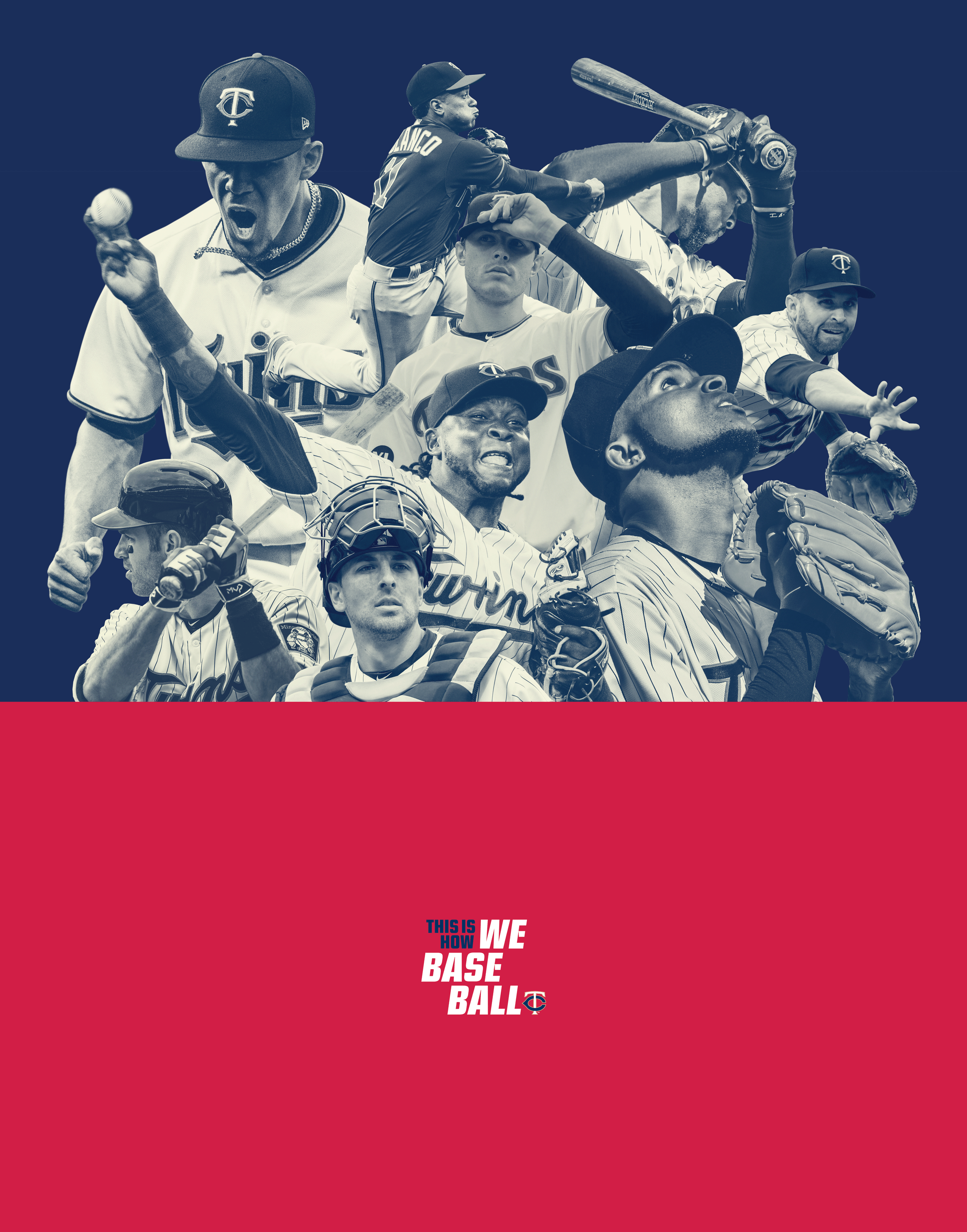
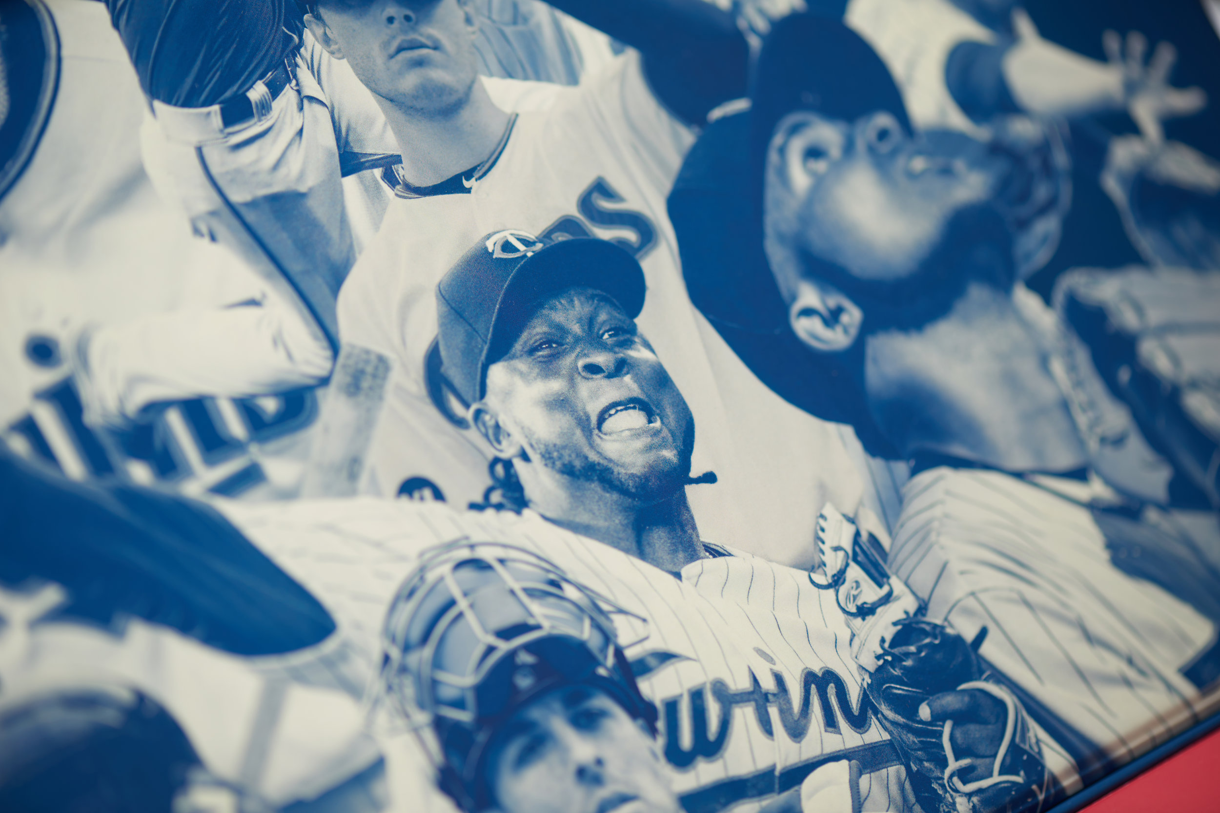
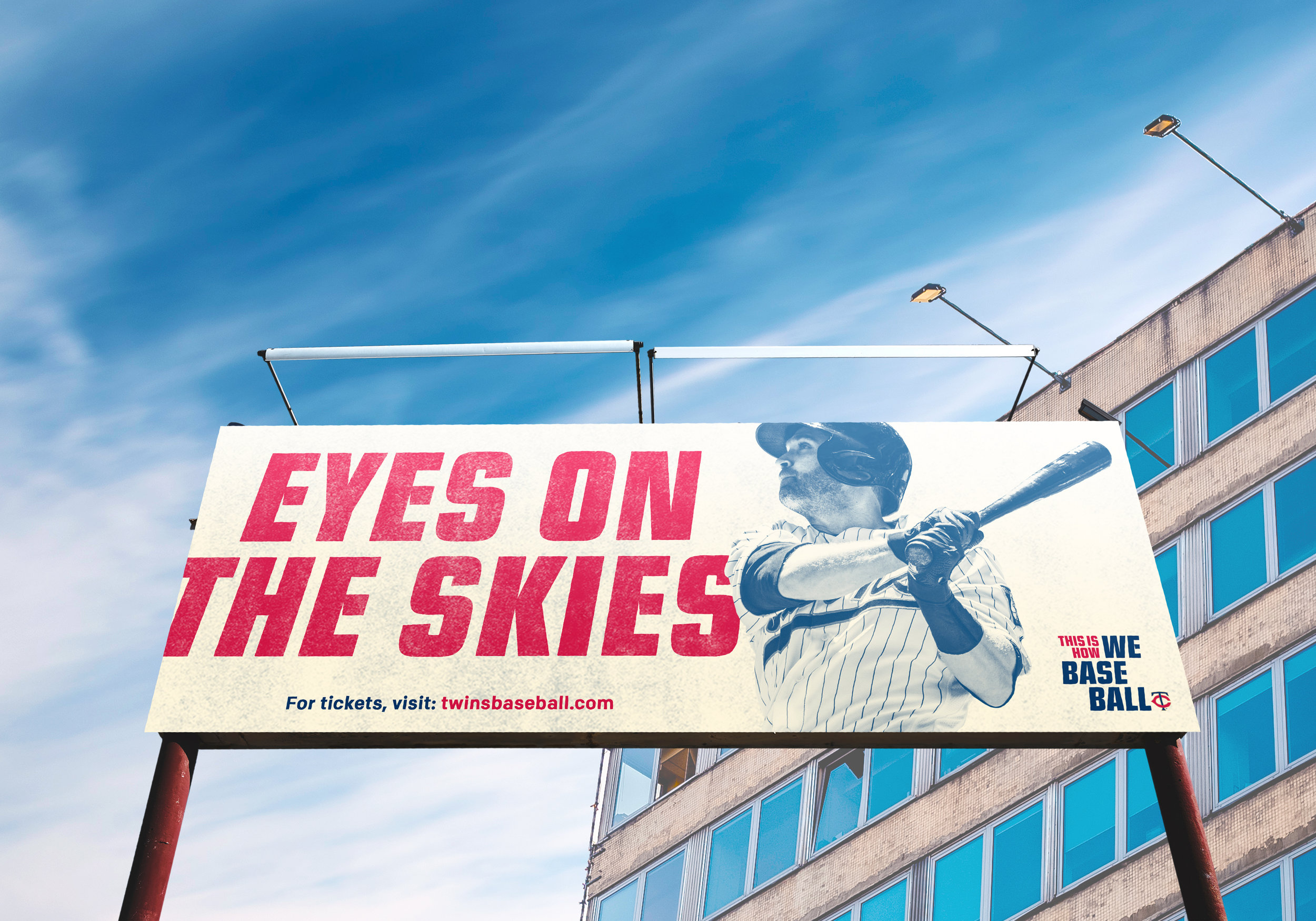
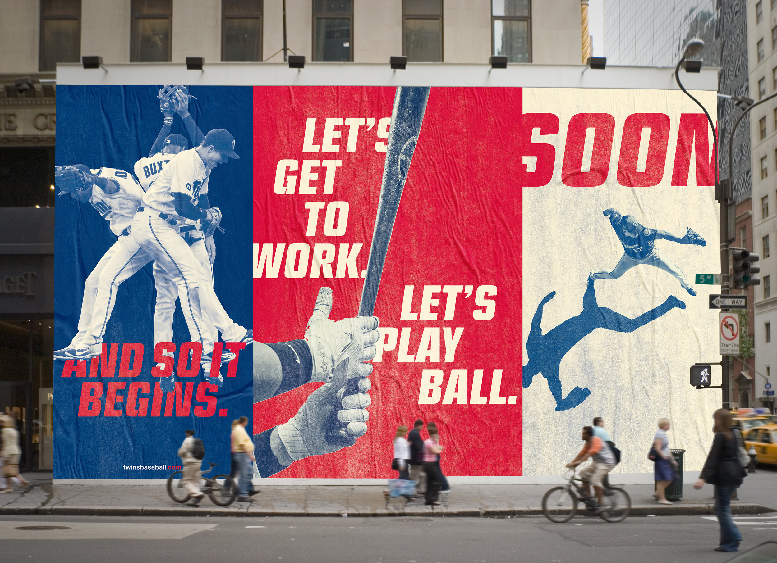
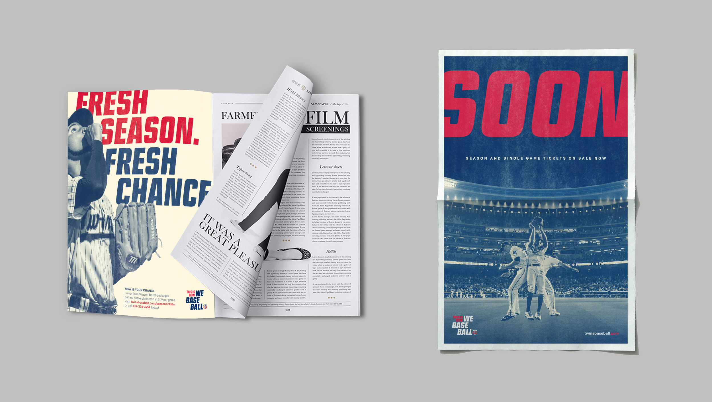
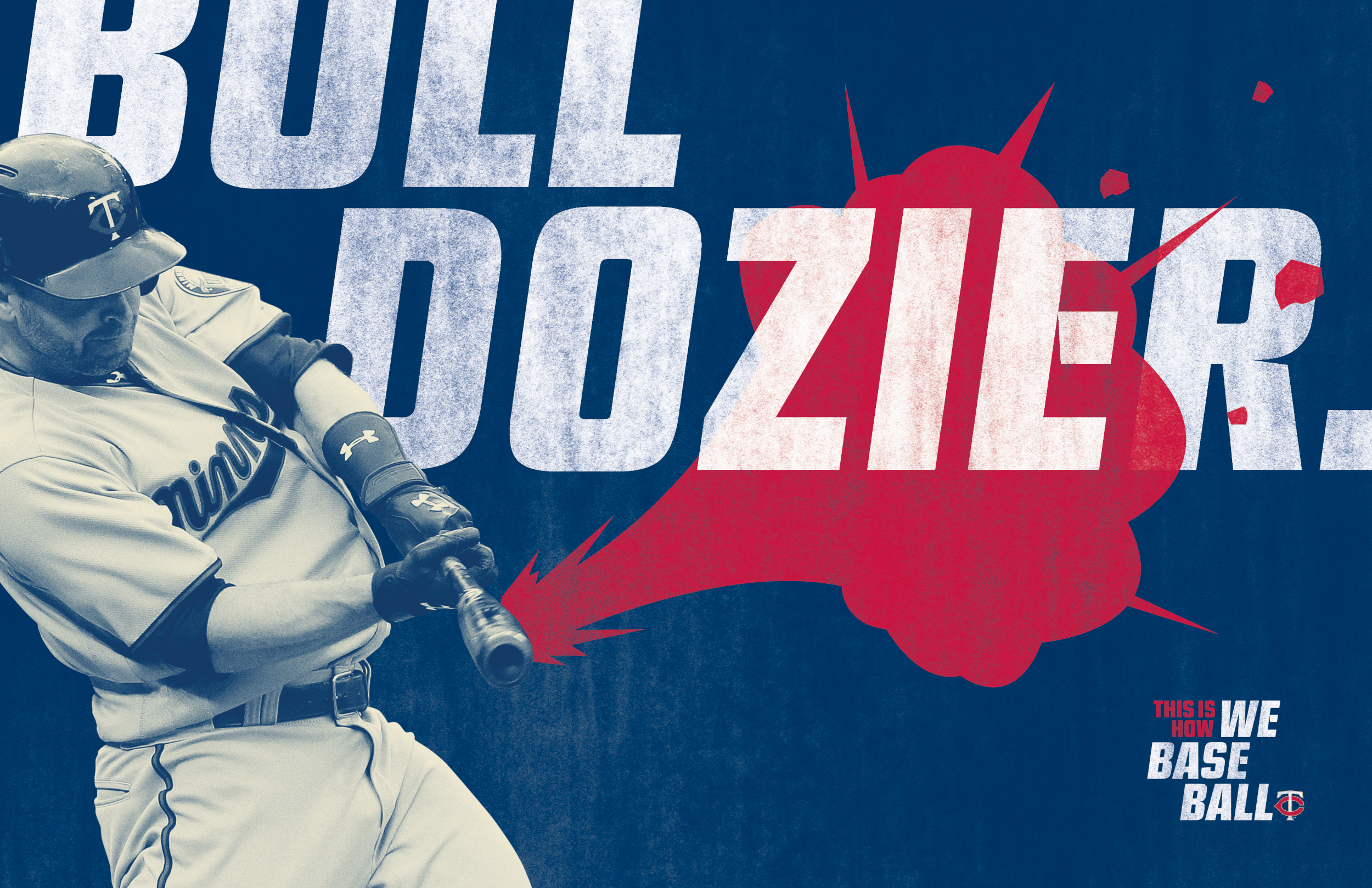
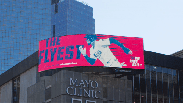
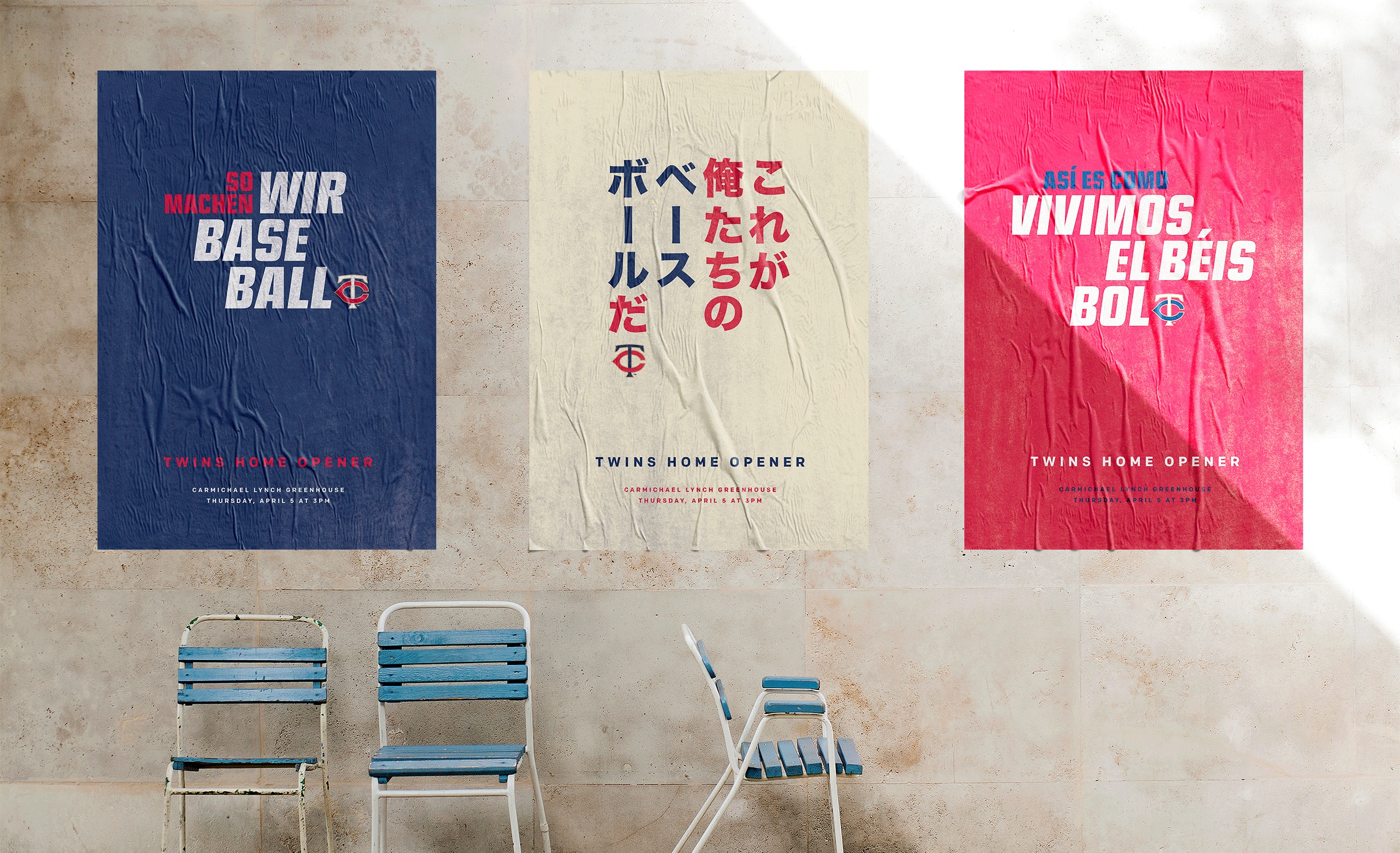
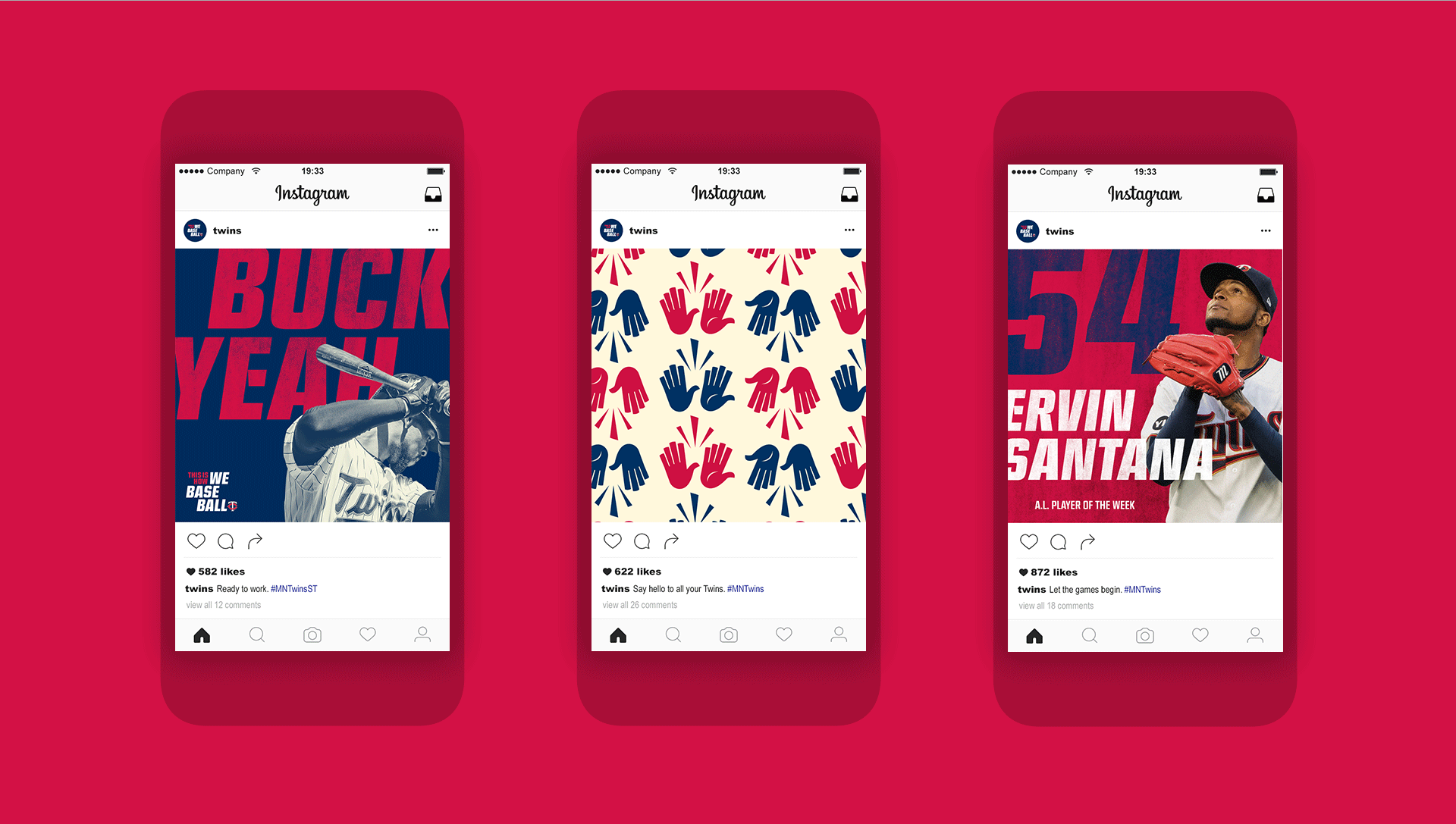
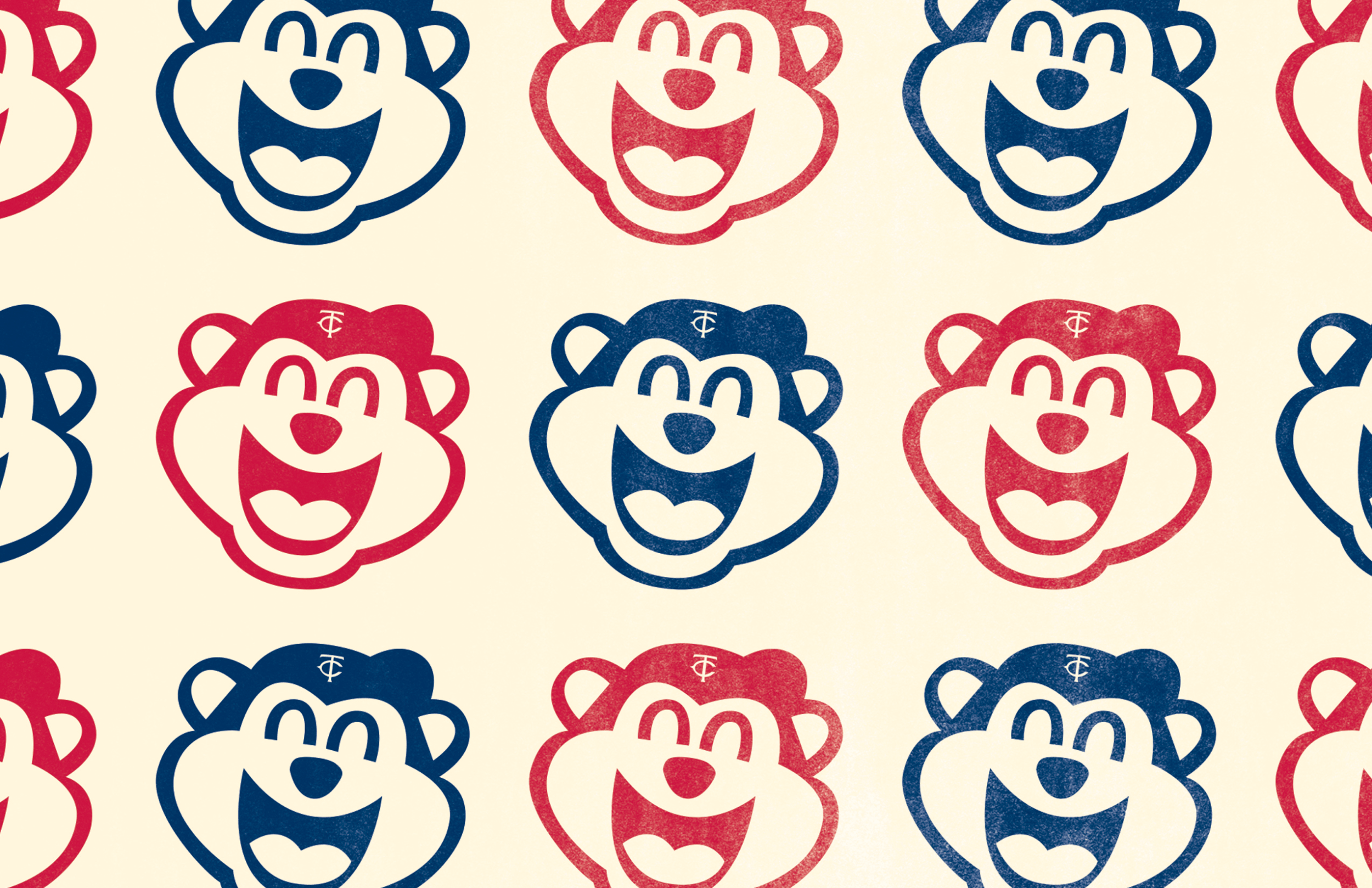
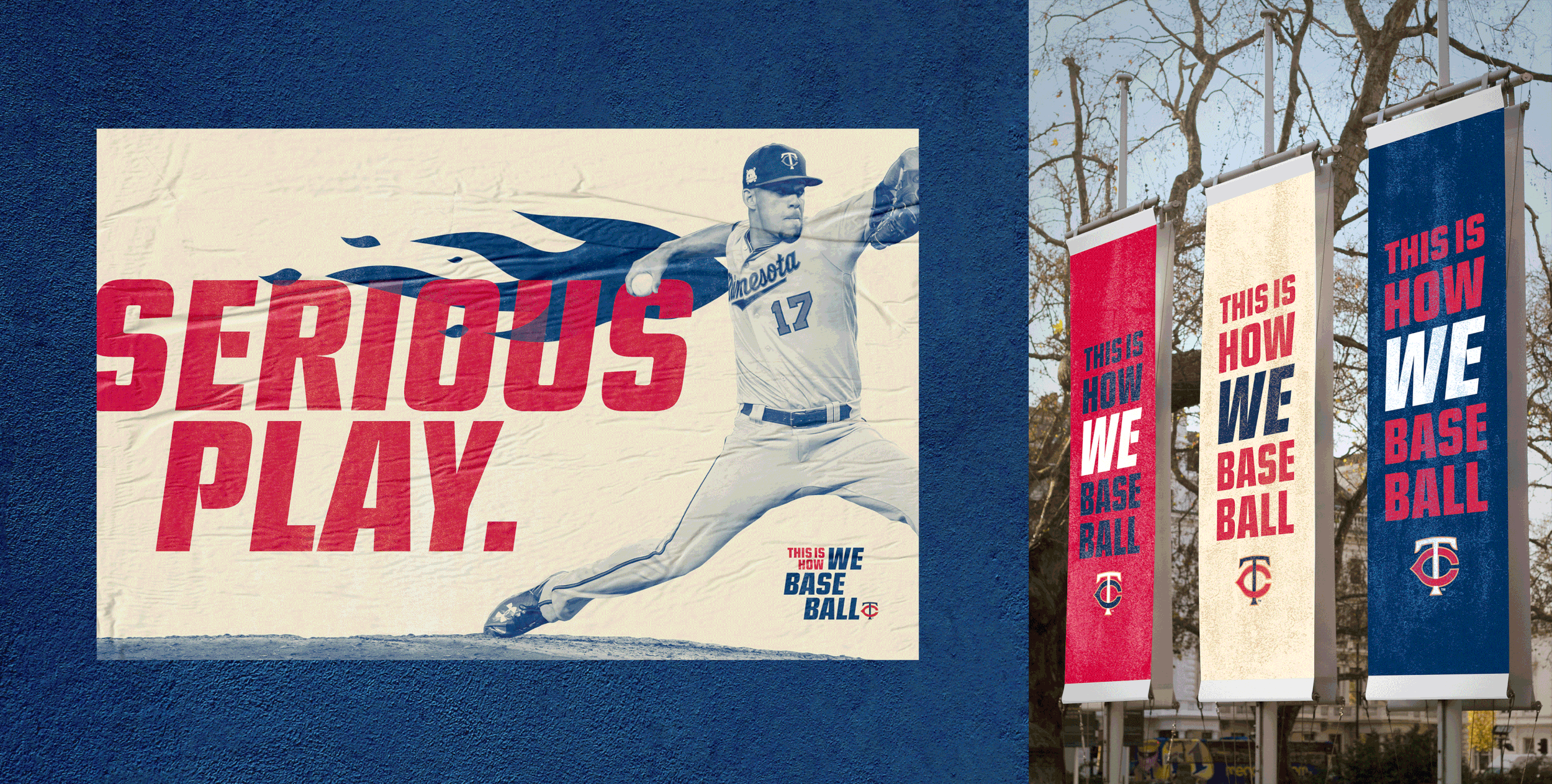
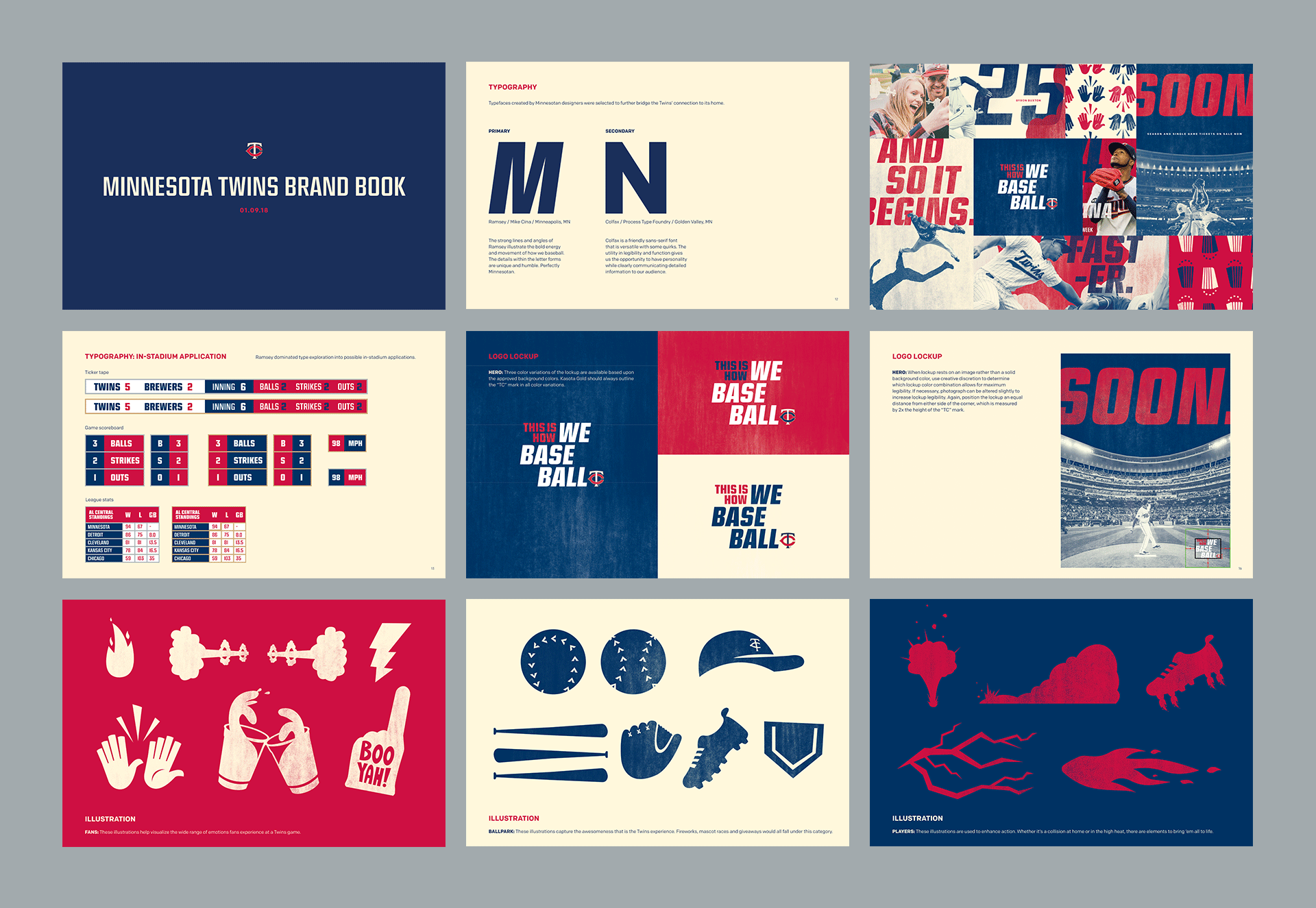
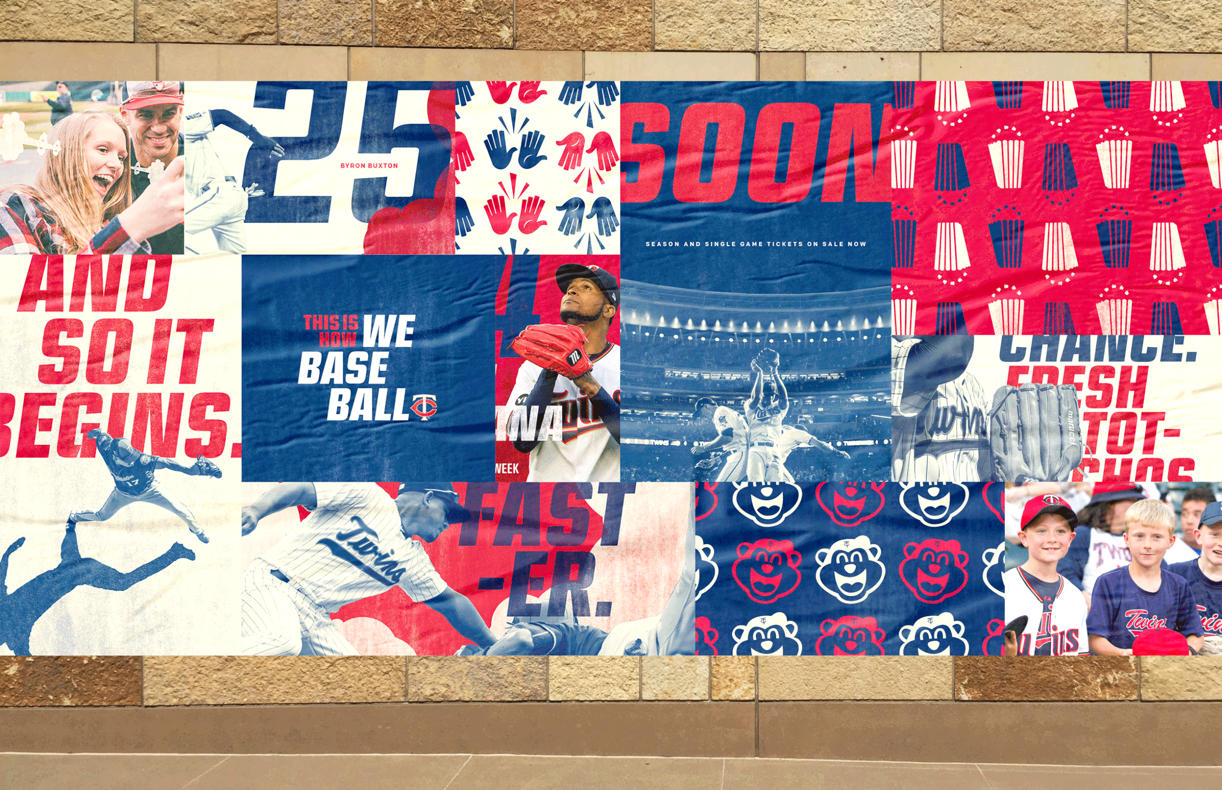
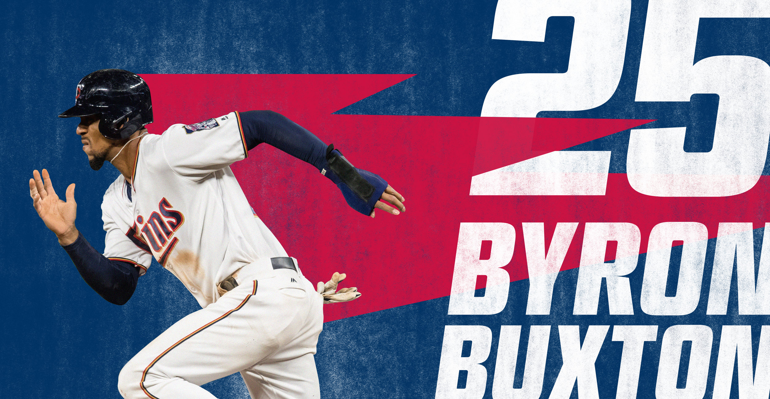
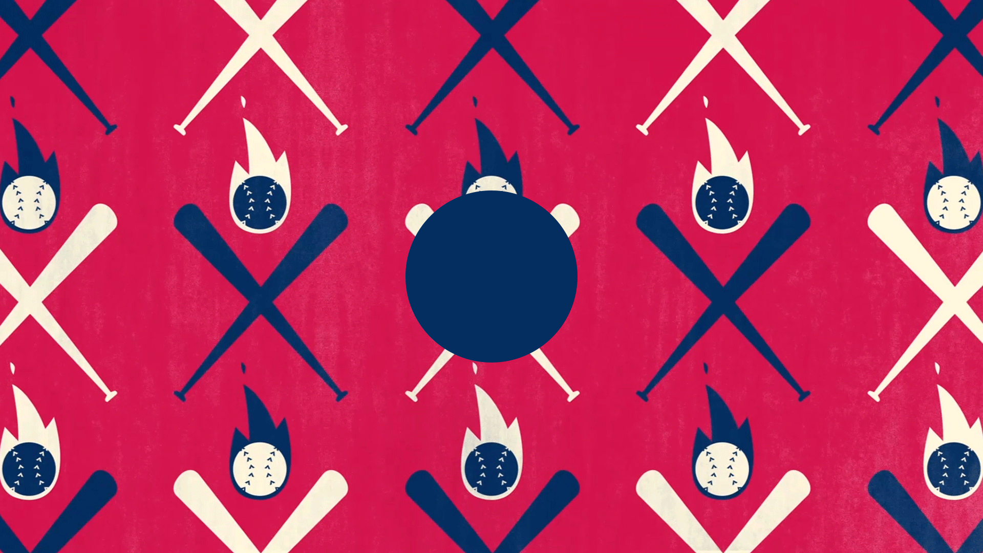
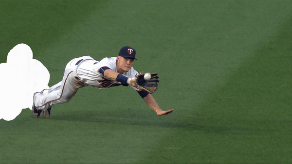
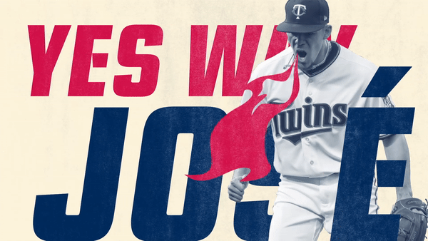
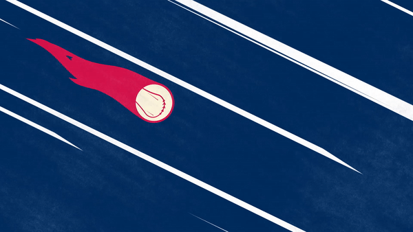
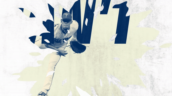
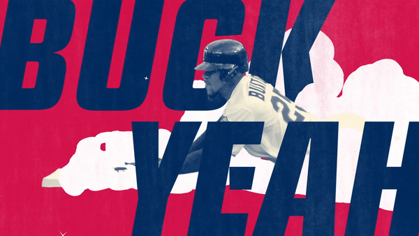
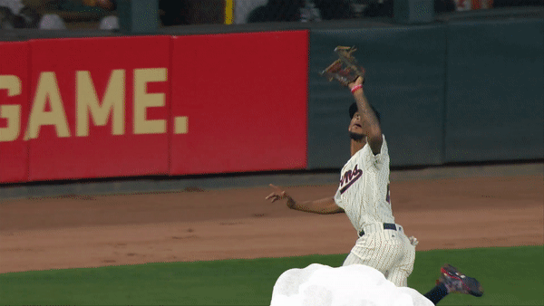
After clinching a playoff spot in the 2017 season, the Minnesota Twins wanted a full redesign for their 2018 season—the friendly, American past-time team was officially out. With mission in mind, the “This Is How We Baseball” campaign was launched. The foundation of the campaign design was a modular system of bold typography, imagery, illustrations, and textures that enhanced momentum. Alongside loud layouts and imagery, key design choices made the campaign ownable to the Twins, such as using typography exclusively designed by local Minneapolis artists, sourcing all imagery and textures from Target Field, and producing a campaign logo lock-up that loosely mimics the Minnesota state shape. Using this fresh design system, a broad collection of work was produced for the campaign launch and subsequent 2018 season that stood out amongst the noise of sports advertising.
Roles: art direction, graphic design, logo design, branding + identity, color theory, typography, layout, print production
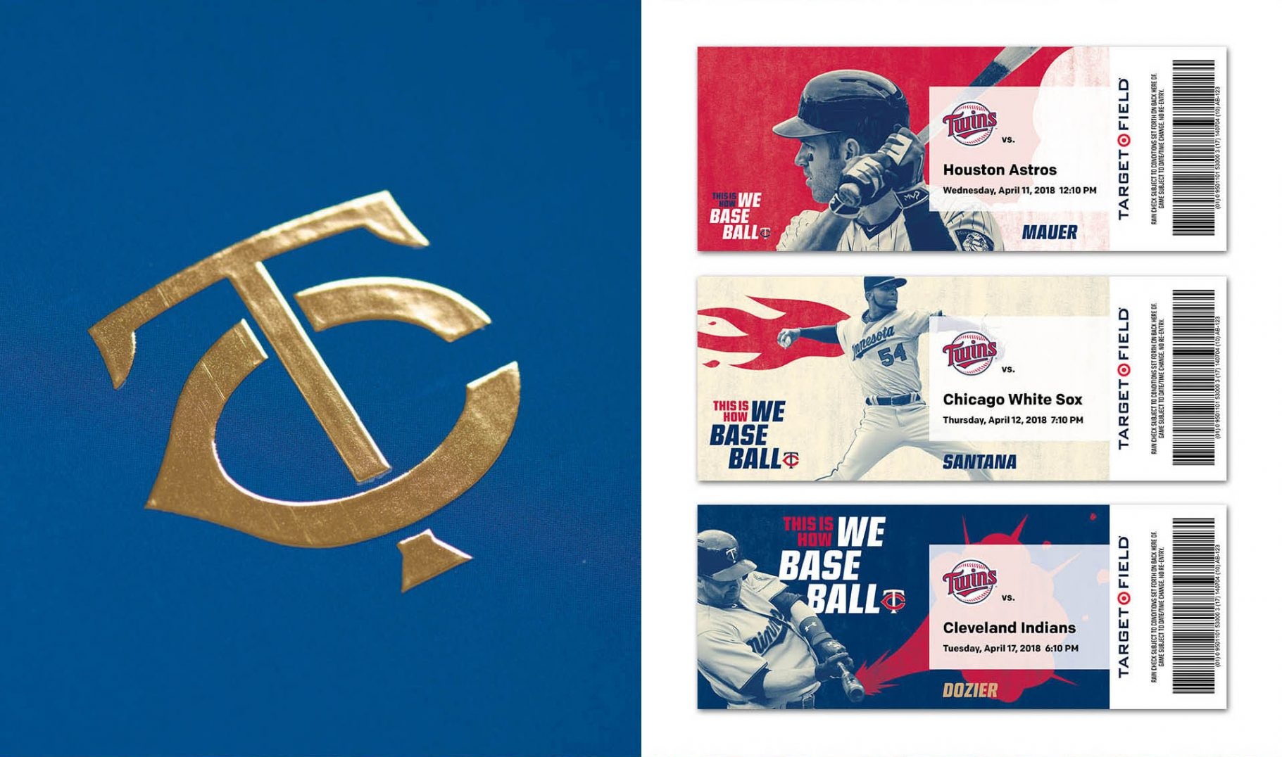
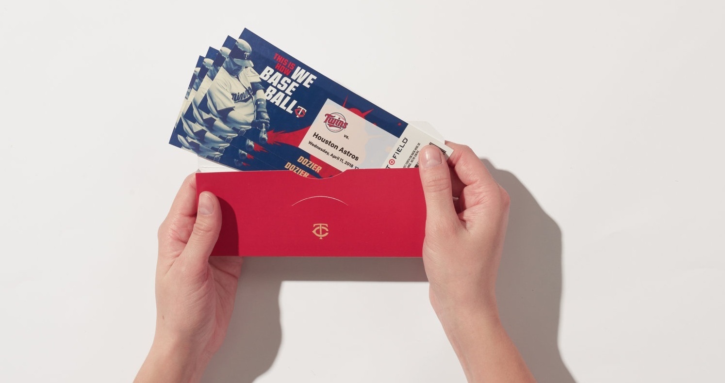
Deliverables: comprehensive set of brand guidelines, campaign logo lock-up (English, Japanese, Spanish, German), two commercial spots, season ticket-holder box, StarTribune newspaper spread, static + animated billboards, collection of posters, social media teasers, magazine ad, digital banner ads
:30 — CAN’T STOP | WON’T STOP TV SPOT

:30 — WE’LL BEAT YA TV SPOT

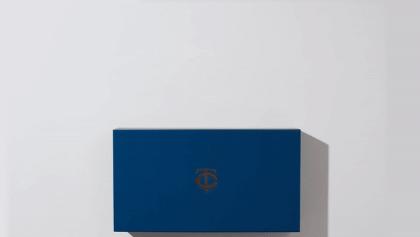
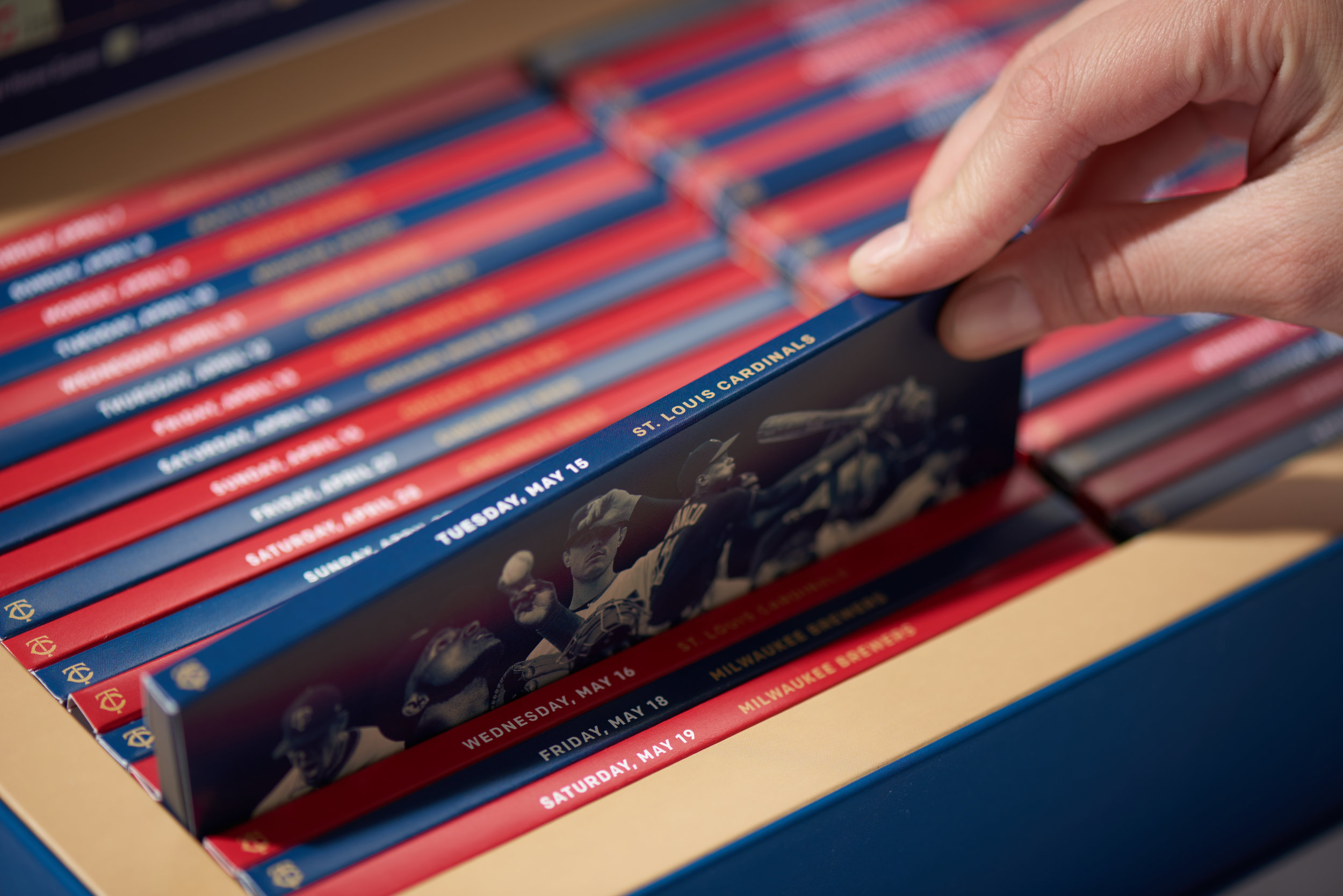
SEASON TICKET BOX